Logo is growing up with company
25. 11. 2010 | News
Information about the upcoming logo change.
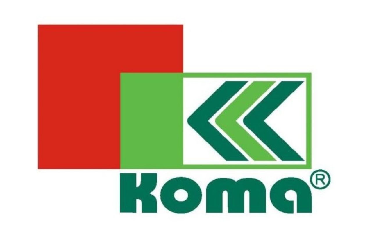
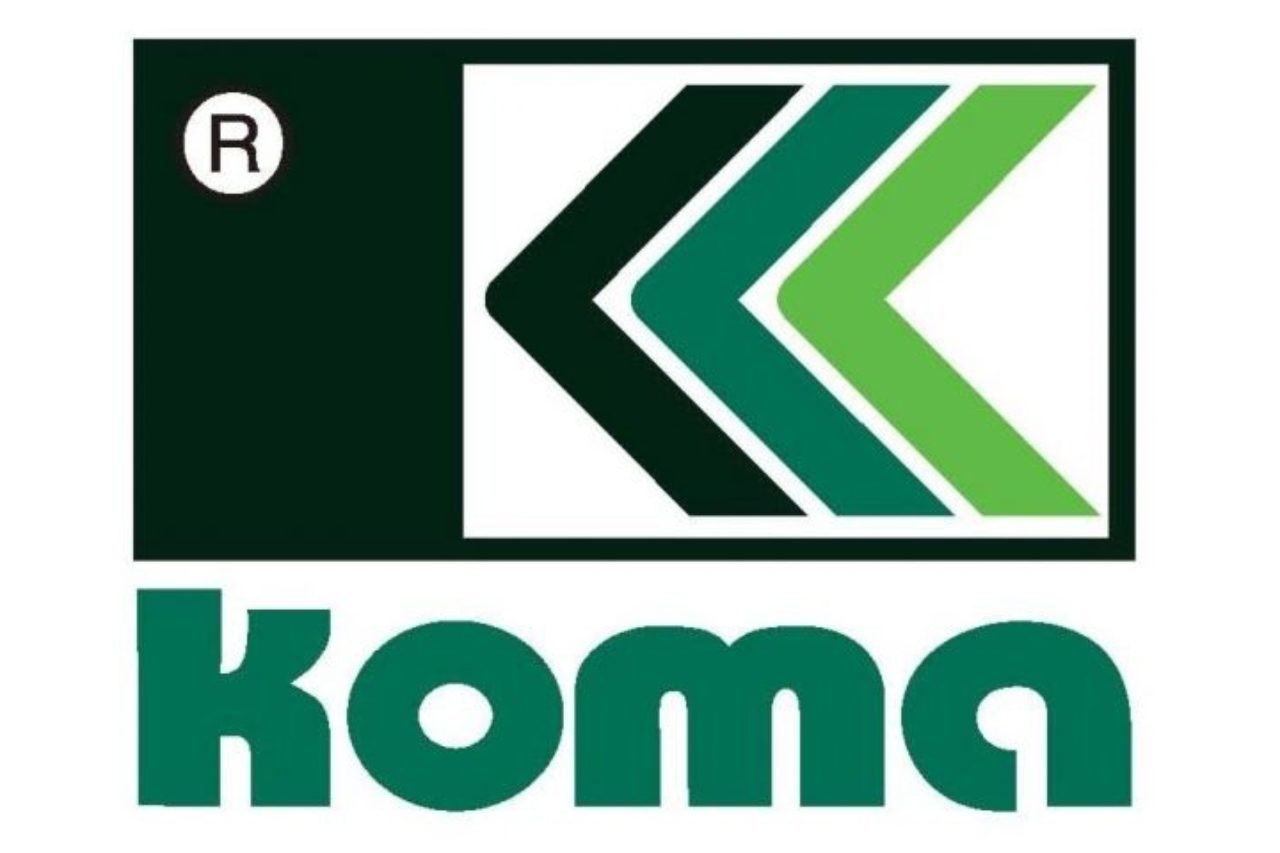
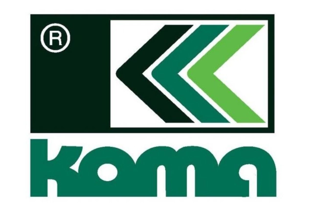
The logo should represent the company´s mission and should develop alike the company development. Our company is going to change logo and use a new logo from the new year. Presently, the logo KOMA is used by the parent company KOMA MODULAR CONSTRUCTION, and also by two sister companies KOMA RENT and KOMA SLOVAKIA. In year 1992 was our logo designed by the sculptor Mr. Boris Kožucharov. In the original logo, there were three colors - black, dark green and light green. Logo expressed a product - container - and three letters V (written bottom up) inside the rectangle represented the fact that the assembles of these containers can be built up in three floors. Bottom up letters V inside the rectangle also associated the letter K, as the initials of our company. In 1998 was the logo simplified, only two green colors were left and before that the name KOMA was adjusted. This logo had been used by the year 2006, and in this time a red squere was added to the logo. The red squere expressed the heart and life, because the staff stand behind all of our business. The logo change by adding the red square was made by son of the original creator Mgr. Martin Kožucharov. The red color associates an interest and so we believe, that it associate an interest to buy.
All the time, the main motive was a rectangle, expressing a container with three botom up letters V inside, showing the stacking. Our company produces the standard dwelling containers in product line StandardLine, which are three stackable containers, as well as other product lines, such as economic non-stackable module EconomicLine, which is assembled from the elements without using a crane, but also a product line ComfortLine, where we can meet the requirements of low-energy buildings and build up more than three floors.
The current logo design, which is also made by M. Kožucharov, contains two colors - red (concrete people stand behind the concrete products) and light green. We beileve that for the most people is the activity in our company in addition to raising funds for subsistence and hearth think. The second color - light green color express our positive relationship with the environment in both the manufacturing process itself, so we save the environment and our products are completely recyclable, and so modular construction minimize the burden on surrounding buildings. Square expresses the modular construction. The logo has a modern look with an emphasis on design, which we assert in our products, in working with architects and organising the architectural competitions and seminars with the theme of modular construction. We believe that the new logo is an expression of quality and reliability, as you have been used in touch with our company.
